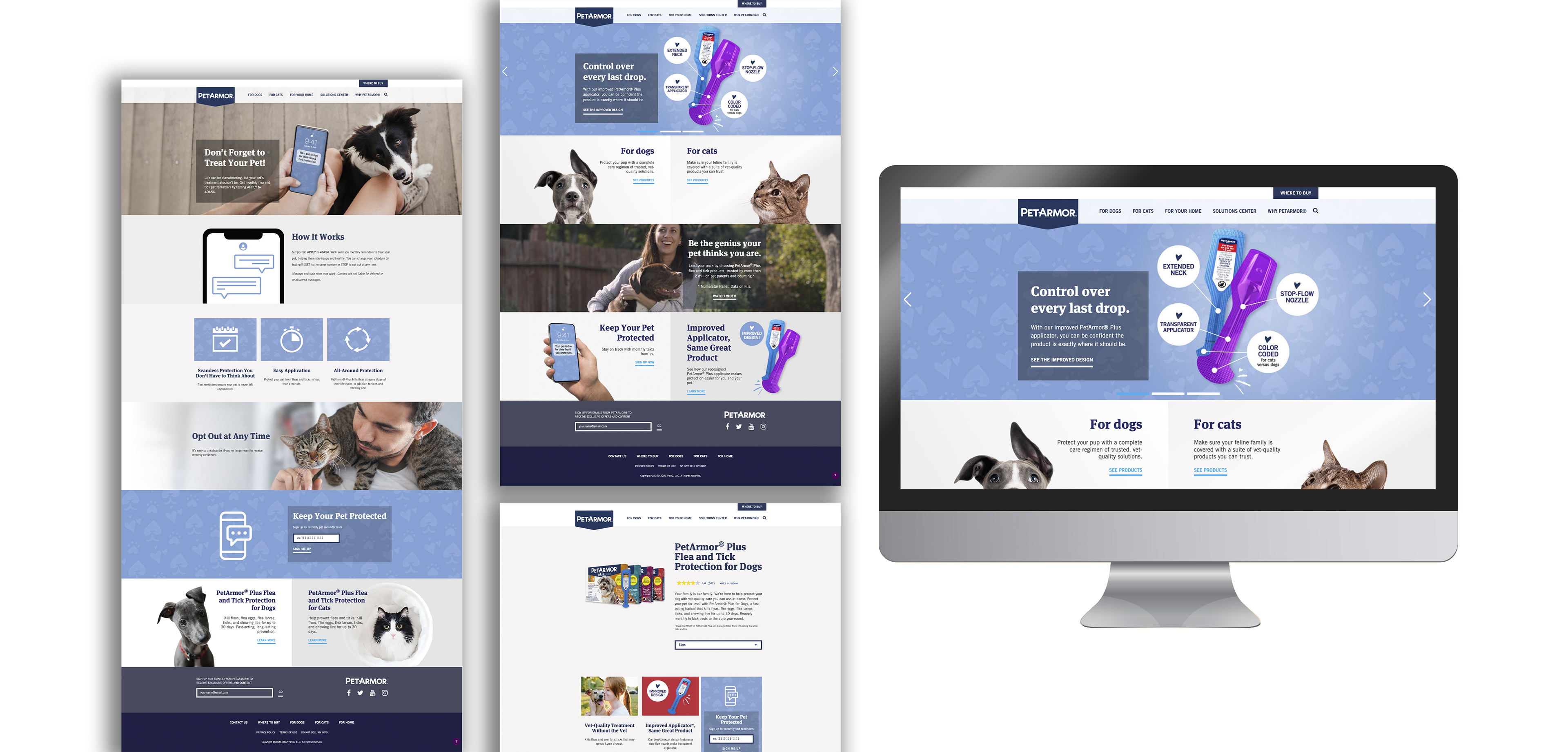
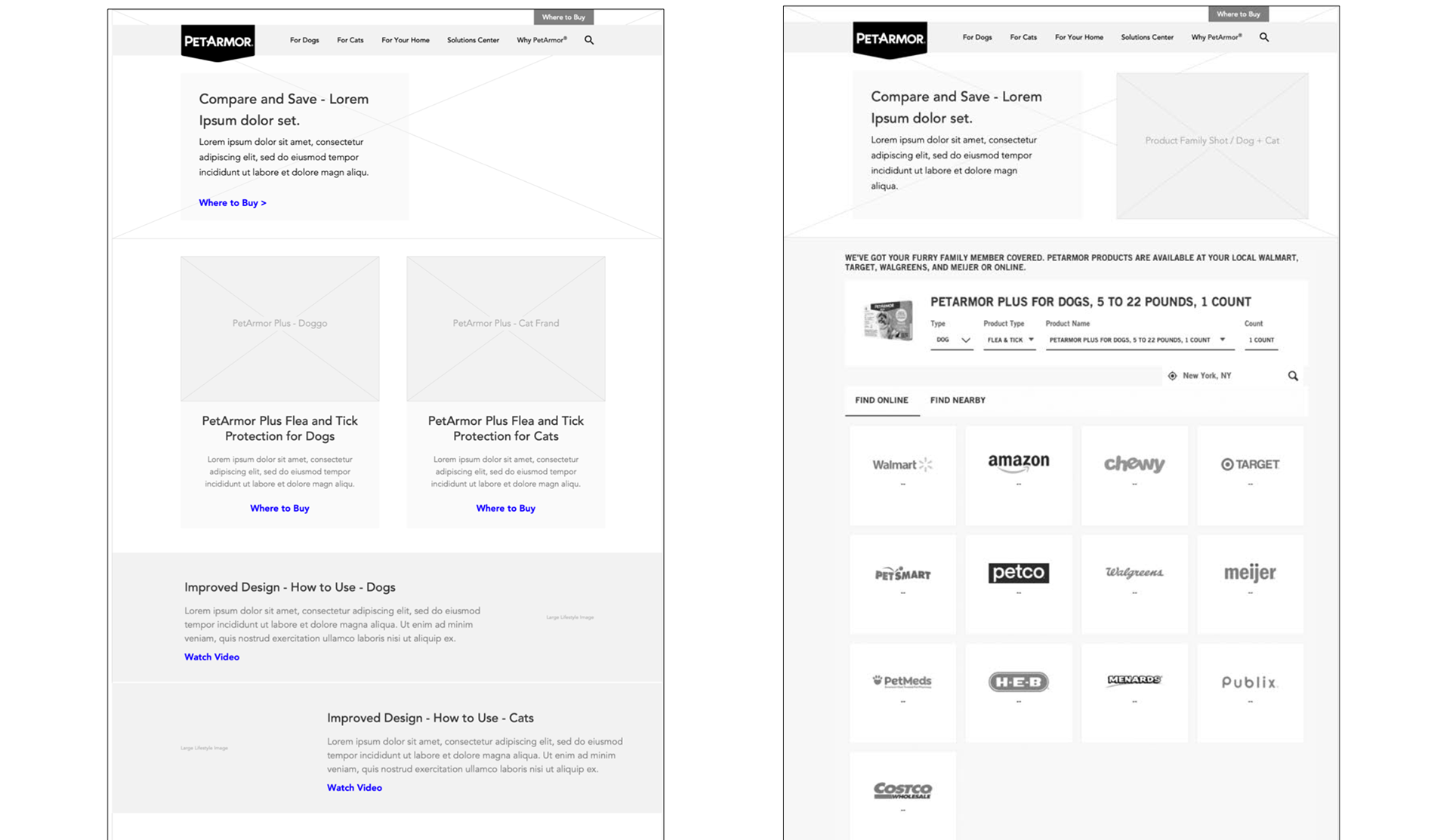
Final UI showcasing the redesigned Applicator page and Compare & Save layout, balancing strong sales messaging with regulatory clarity.
My Role
I was responsible for UX strategy, wireframing, and UI design, as well as guiding the responsive layouts. This meant collaborating closely with Marketing, Sales, Regulatory, and Copywriting teams to balance persuasive sales messaging with clarity and compliance. The redesign extended across product imagery, messaging hierarchy, and responsive web design.
Wireframes & Exploration
I began by mapping the user journey and sketching wireframes to identify where headlines, calls-to-action, and comparison details would have the most impact. Early exploration focused on streamlining the “path to purchase” so pet parents could understand both product use and price advantages quickly.
Landing pages emphasized comparison and clear product differentiation, with strong conversion-oriented CTAs.
Impact
The redesign helped PetArmor showcase its product advantages more effectively. The Applicator page simplified usage messaging and built customer confidence, while the Compare & Save section provided a clear, trustworthy reason to choose PetArmor over competitors. Together, these updates improved engagement, strengthened brand trust, and supported sales growth in a competitive category.
Final Visual Designs
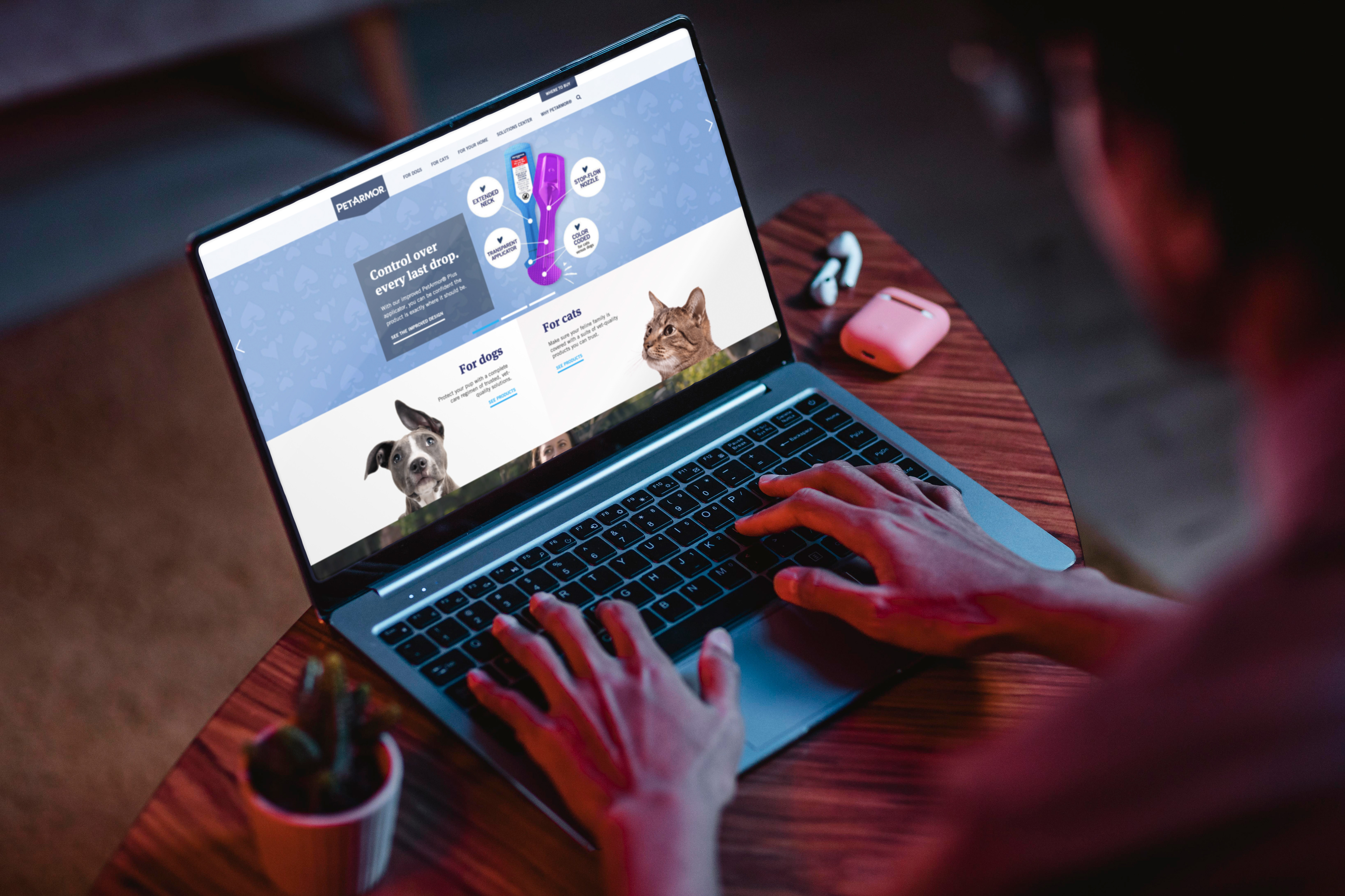
The finished designs emphasized conversion-first layouts. Product imagery was bold, comparison tables were simplified for easy interpretation, and strong CTAs were placed where users needed them most. The final system was built responsively, ensuring the experience translated seamlessly from desktop to mobile.
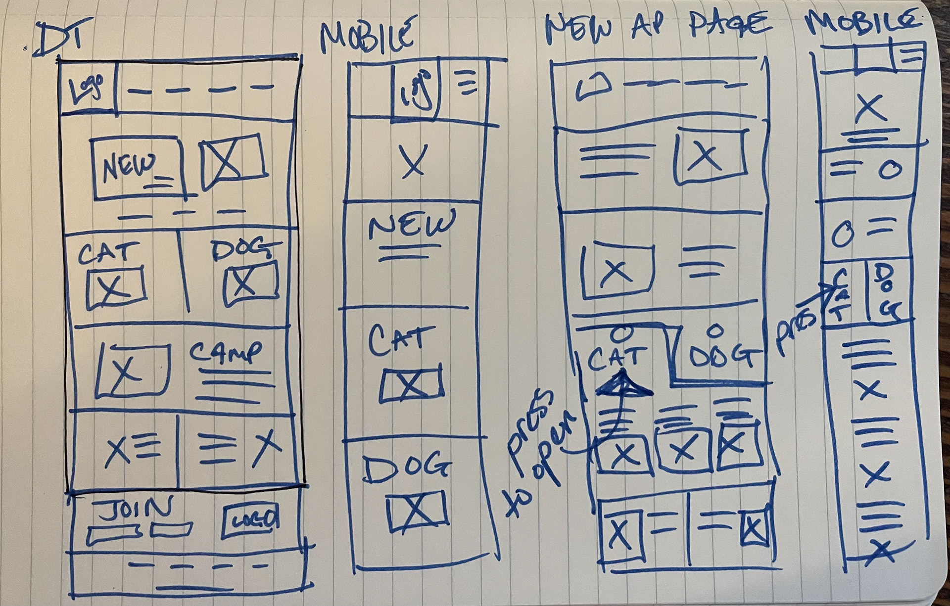
Initial sketches explored mobile-first layouts to prioritize on-the-go pet owners.
Wireframes illustrating the redesigned path to purchase, showing how value messaging and usability were prioritized from the start.