
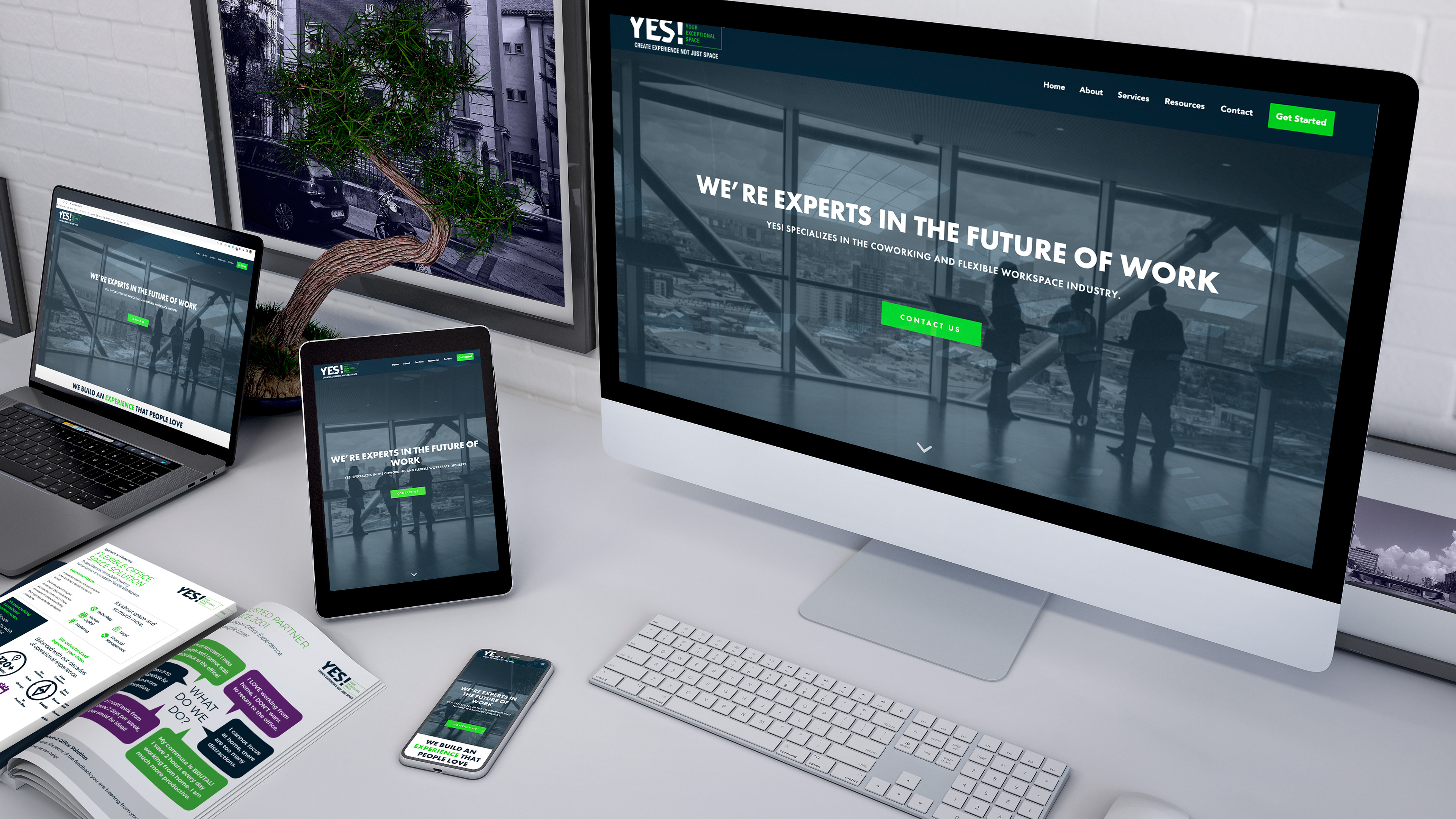
Mobile & Desktop Designs
The final layouts feature clean visuals, intuitive navigation, and prominent calls-to-action, ensuring consistency across mobile and desktop. Every element was optimized to support clarity and responsiveness.
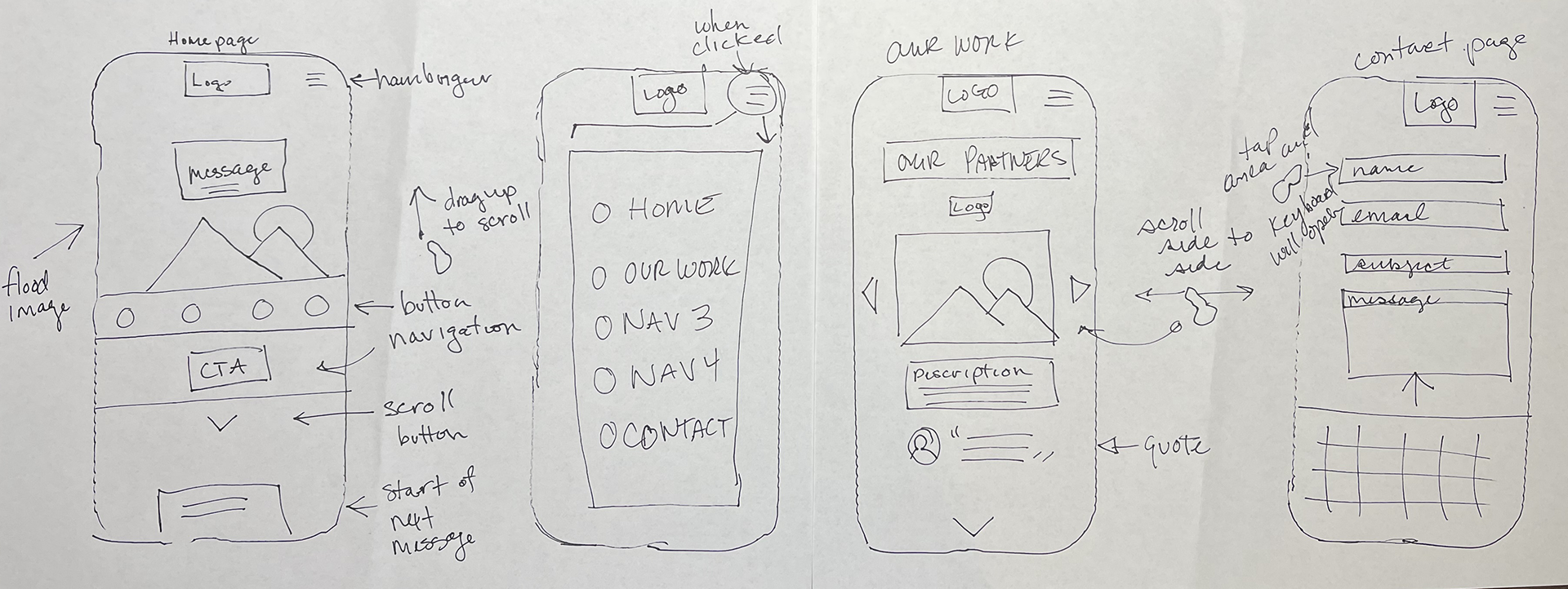
Hand-drawn sketches mapping user flow and data emphasis for mobile navigation.
Sketches
I began by sketching user journeys to prioritize essential information and visual hierarchy for on-the-go users. The focus was on clarity and impact within a mobile-first context
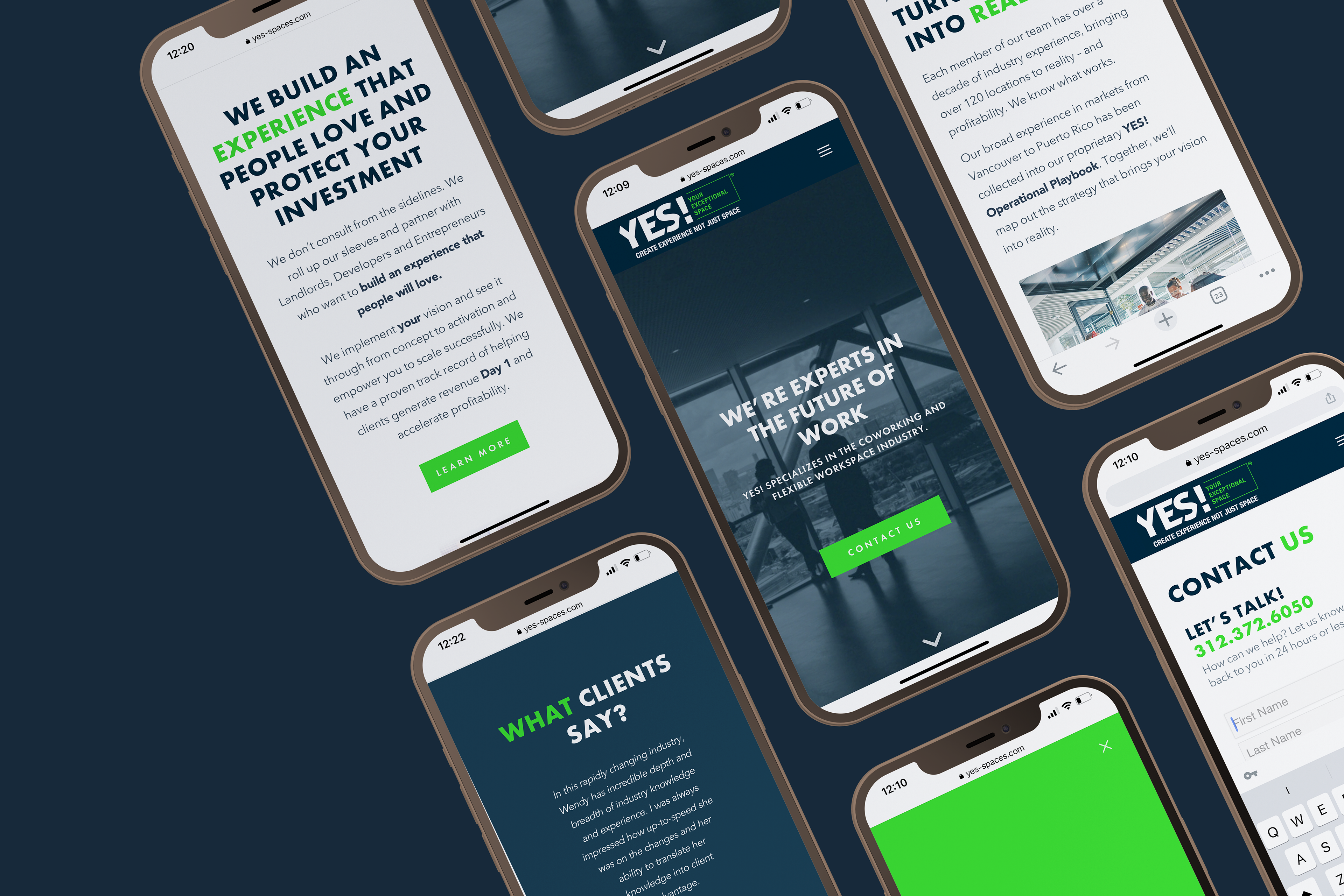
Responsive designs deliver elegant, user-focused experiences across mobile and desktop alike.
Impact
The site launched smoothly, achieving its core mission: effectively guiding prospective clients to key information and contact points. In just one quarter, the website supported the client in meeting—and exceeding—her business goals.